humble-modal - Another React Modal Component
That’s it folks. There’s a bunch of React Components out there and you can ask: Why do I need another React Modal Component? To be honest, maybe you don’t. But I did! Then I decided to create a new one which would suit my expectations.
Let me explain:
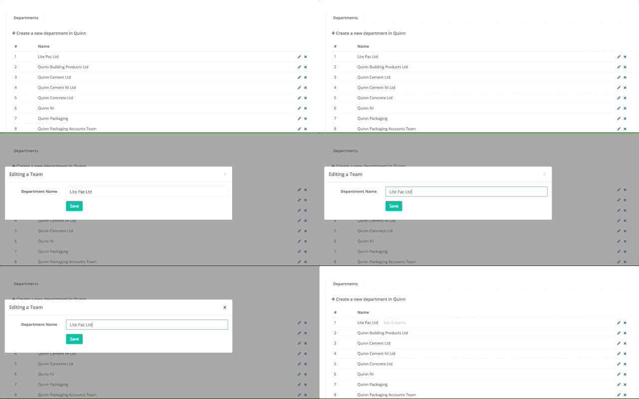
I had to create a form for editing an object after the user click on it from a list. Then I thought a modal would fit well for that. Way to simple. A modal that would open in the middle of the screen, with a title, a form inside, a close button in the corner and a black background behind the modal element.

I decided to take a look at npmjs and I found quite a lot of react modals over there. However, most of them (at least the ones I looked) were too complicated for a simple task. Of course if I had picked one of them I would have acomplished my task with success. They are all very nice! But what I mean is that they all had a few props or even functionalities that I wouldn’t need it. I wanted something as simple as possible. And I couldn’t find it.
So, I ended up creating my own React Modal Component.
Later, I thought that maybe someone else could have the same problem (or frustration) of not find something easy and simple like I had. Besides that, would end up being a good thing for me since I’d never created a JS package before.
And from that humble-modal was born.
It doesn’t aim anything other than simplicity.